Color Psychology in Interior Design: Why it Matters More Than You Think
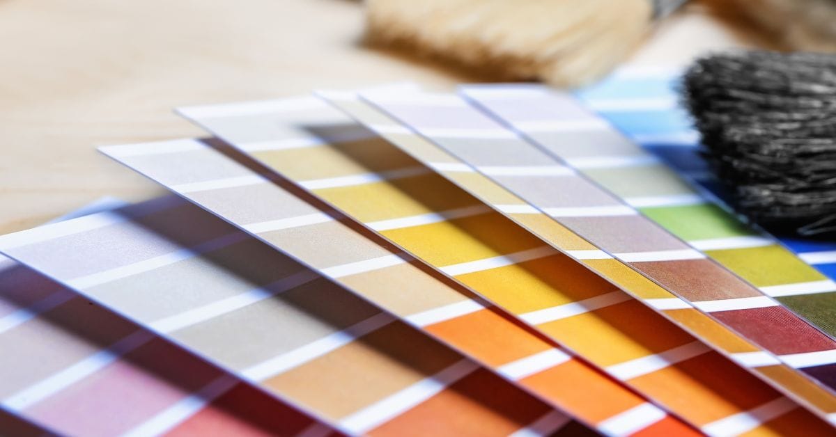
If you’ve ever stood in the paint aisle frozen in panic while holding five nearly identical swatches of beige, welcome to the club. Picking colors for your home sounds easy until you’re the one doing it. It’s not just about what looks “pretty.” A wrong color can throw off the whole room vibe, make the space feel off, or even mess with your mood.
That’s because colors aren’t neutral. They’re emotional. They influence how we feel, how we behave, and even how we interact with people in a space. That’s where interior design color psychology steps in. When you understand what colors actually do to a space, and to the people in it, you’re no longer just picking a paint chip. You’re setting the tone for how you want to feel in your home.
And don’t worry, we’re not here to tell you every room needs to be beige or that only “cool tones” are allowed. This is about using the psychology of color in interior design to work with your space, not against it.
What “color” really means in design terms
In the world of interiors, color isn’t just red, blue, or green. It’s light, saturation, temperature, and how it all interacts with your walls, furniture, and lighting. The definition of color in interior design covers both the visual and emotional impact of color. You’re working with hue (the actual color), value (how light or dark it is), and intensity (how strong or soft it looks).
For example, “green” can mean a vibrant lime or a soft sage. One feels energetic, the other calming. Same color family, totally different mood.
Designers don’t pick colors in a vacuum. They think about how a specific color will behave throughout the day, under natural light, next to furniture, or on a north-facing wall. A warm white in one room can look icy in another depending on these factors.
So when we say “color matters,” we’re not talking about trends. We’re talking about how it changes the entire feel of a space. That’s the core of color psychology in interior design, the emotional fingerprint of every hue.
Quick explanation of interior design color psychology
Color affects people. Period. There’s loads of research showing how color impacts mood, energy, and even behavior. That’s the foundation of interior design color psychology. You’re using color not just for looks, but to nudge emotions in a certain direction.
The beauty of color psychology is that it’s flexible. You don’t need to commit to painting all four walls eggplant. Sometimes, just a pop of color in your throw pillows or art can shift the entire feel of a space. And that’s a win.
Basics of color theory in interior design
Before you jump into color choices, it helps to understand why certain combinations feel good. That’s where color theory in interior design comes in. It’s not just art school stuff. It gives you practical tools to pair colors with confidence.
Start with the color wheel
Let’s break it down without getting academic:
The wheel helps you see how colors relate. Colors next to each other feel harmonious. Colors across from each other create bold contrast. This matters when you’re choosing everything from wall paint to rugs to curtains. You don’t need to memorize it, you just need to know how to use it as a cheat sheet.
How to actually use color combos in a room
Here are a few go-to approaches designers lean on:
You’re not locked into any one formula. These are starting points. You can always layer in neutrals, textures, and metallics to break things up.
Science behind color perception and mood
Okay, time for a quick science detour. Two psychological concepts help explain how we physically and emotionally feel color in a space:
Opponent-process theory says our brains see colors in pairs, red vs green, blue vs yellow. That’s why a room with strong opposing colors feels high energy. Your brain can’t focus on both at once, so it creates tension, which makes things feel dynamic1.
Hue-heat hypothesis explains why colors “feel” warm or cool. Reds, oranges, and yellows are perceived as warm. Blues, greens, and purples feel cool. That’s why designers often use warm tones in cold rooms and cool tones in bright, sunny ones. It balances the temperature visually, even if the thermostat stays the same2.
These theories help explain why a deep navy bedroom can feel like a cozy cave and why too much yellow in a windowless room might feel like a tanning bed. It’s not just about style, it’s about sensation.
How each color affects mood and space
You don’t need to memorize a textbook to get the feel of what a color can do. The psychology of color in interior design is surprisingly intuitive once you see how certain shades affect mood. Think of each color as having a “personality.” Some are warm and welcoming, others keep their distance. And yes, some definitely need to come with a warning label.
Let’s break it down by hue:
Blue
Blue is the go-to for calm, collected, and focused spaces. It lowers blood pressure, reduces stress, and generally makes people breathe a little easier. That’s why it’s a popular choice for bedrooms and home offices.
Lighter blues feel airy and refreshing, perfect for coastal or modern spaces. Deeper shades like navy or indigo create coziness and sophistication but can feel heavy in small, dark rooms.
Best used in: bedrooms, offices, reading nooks
Use with caution in: north-facing rooms, unless warmed up with wood or brass

Green
If a color could give you a mental health day, it would be green. It’s balanced, restorative, and strongly connected to nature. It doesn’t push or pull emotionally, it centers.
Soft sage, olive, or eucalyptus tones work beautifully in bedrooms, kitchens, and even bathrooms. Brighter greens, like lime or chartreuse, can feel energetic but quickly turn chaotic if overdone.
Best used in: kitchens, home offices, bathrooms, entryways
Use with caution in: overly saturated or neon shades unless used in small accents

Yellow
Yellow brings the sunshine, literally and emotionally. It energizes, lifts moods, and makes a space feel cheerful. But there’s a catch. Too much yellow, especially when highly saturated, can lead to eye fatigue and even irritability over time.
That’s why soft buttery or pastel yellows work better than intense mustard or highlighter tones on large surfaces.
Best used in: kitchens, dining rooms, playrooms
Use with caution in: bedrooms or small enclosed spaces

Red
Red demands attention. It raises energy levels and heart rate. That can be great in small, social spaces where you want buzz and conversation. It’s bold, dramatic, and passionate. But best handled in moderation.
Deep wine or brick reds feel rich and grounded, while fire-engine red is best left to throw pillows or art.
Best used in: dining rooms, powder rooms, accent walls
Use with caution in: bedrooms or meditation spaces (unless you never want to sleep again)

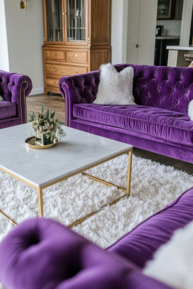
Purple
Purple is the wildcard. It can feel luxurious and moody, or soft and romantic depending on how it’s used. Lavender leans dreamy and light, while deep plum or eggplant brings drama.
It’s less commonly used in main living areas but can absolutely work when styled well.
Best used in: bedrooms, dressing rooms, moody powder rooms
Use with caution in: open-concept spaces where it might dominate
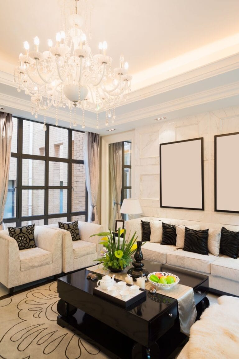
Neutral tones (white, gray, brown, black)
Neutrals are the backbone of most interiors, but they still carry emotional weight.
The trick with neutrals is balance. Layer textures, mix warm and cool elements, and use them to anchor bolder accents.
Best used in: everywhere, depending on tone and finish
Use with caution in: large doses without contrast or texture
Why context changes everything
Picking a color based on how it looks in a showroom is like buying shoes based on how they look in the box. Context is everything. The same sage green can feel soothing in one space and drab in another, depending on what’s around it.
Room function matters
Before you pick a color, ask what you want the room to do. Should it calm you down or wake you up? Make people feel welcome or focused?
Bedrooms and bathrooms usually benefit from cooler, calming tones. Kitchens and dining areas often do better with warmer, energizing colors that spark appetite and conversation.
Your paint should match the purpose, not just your Pinterest board.
Lighting changes everything
Color never exists in isolation. A room’s orientation, natural light levels, and even bulb type affect how a color shows up.
Also, don’t underestimate artificial light. Warm white bulbs can skew color toward yellow, while daylight bulbs can make things feel harsher or bluer.
Cultural and personal associations
Color preferences aren’t universal. Some people associate white with peace and purity, others with emptiness. Red might feel cozy to one person, aggressive to another.
Cultural context also plays a role. In some places, certain colors carry deep meaning, white might be used for mourning, yellow for wealth, or green for healing. These meanings affect how people feel in a space, even if they’re not aware of it.
Designers take this into account, but so should anyone painting a room they’ll spend time in. If a color brings up a weird memory or vibe, trust your gut.
What to avoid when picking color
Even with the best intentions and a well-organized Pinterest board, color mistakes happen. We’ve all had that moment where a wall dried three shades darker than expected or a trendy gray turned blue under certain lights. Here are some of the most common color slip-ups people make, and how to avoid them.
1. Choosing overly bright or neon hues
Loud colors might feel exciting on a paint chip, but on a full wall? They can get overwhelming fast. Neon greens, highlighter yellows, or traffic-cone oranges tend to vibrate under indoor lighting and cause visual fatigue. Great for sneakers, not so great for a dining room.
A quick story about yellow gone wrong
One of my friends wanted to “brighten up” her entryway, so she went with a cheerful, lemony yellow. It looked cute on the paint chip. After painting, it looked like Big Bird had exploded in a five-by-five foyer.
Even worse, it reflected into every room nearby and gave everything a strange greenish cast. She repainted it within a week.
Moral of the story? Bright paint colors multiply their effect in small spaces. Go a few shades softer than you think you need, your eyeballs will thank you.
What helps: If you love bold colors, try them in small doses, pillows, art, a lampshade. Keep the walls calmer.
2. Overusing cool grays or stark whites
That icy gray might look modern in a showroom, but without the right lighting and warmth from other finishes, it can make your space feel more like a dentist’s office. Same goes for bright white, what should feel fresh can end up feeling sterile and unwelcoming.
What helps: Mix in warmer tones, textured fabrics, or wood elements to balance cool palettes.
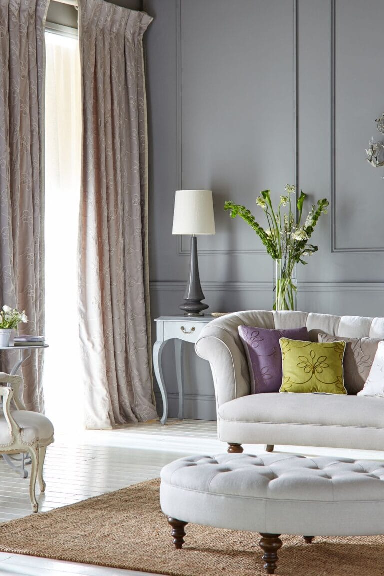
3. Ignoring how lighting affects color
Paint that looks like the perfect greige in daylight might turn pink or green under warm indoor bulbs. Light changes everything. Failing to test a color in multiple lighting conditions is one of the biggest reasons people regret their paint choices.
What helps: Swatch generously. Paint large samples on more than one wall and check them morning, afternoon, and night before committing.
4. Picking colors straight from trends
Just because a color is “in” this year doesn’t mean it fits your home. Trend-driven choices often clash with your existing finishes, furniture, or even the mood of the space. If you don’t actually like terracotta or millennial mauve, skip it.
What helps: Let trends inspire accents, not dictate the whole palette.
5. Forgetting to coordinate undertones
You’ve got a beige wall, a gray sofa, and white trim, and somehow it still looks…off. That’s probably undertones clashing. A cool gray next to a warm beige can feel mismatched even if the colors are neutral.
What helps: Always compare samples side by side before deciding. Look for pink, green, yellow, or blue undertones that may not be obvious until they’re next to each other.
Practical color theory interior design strategies
Understanding color theory in interior design is great, but applying it to real homes? That’s where the magic happens. These strategies make your choices feel more intentional and less like a guessing game.
a) Start with the 60-30-10 rule
This classic designer formula helps you build a balanced palette:
You don’t need to be exact, but the general breakdown keeps the space feeling layered, not chaotic.
b) Use complementary or harmonious palettes to add contrast or calm
Complementary colors, like blue and orange, create visual energy.
Analogous colors, like green and blue, feel more fluid and peaceful.
Monochromatic schemes play with tints and shades of the same hue for a clean, minimal look.
These palettes tie back to color theory interior design, which helps explain why some color combos feel sophisticated while others feel off.
c) If you’re unsure, go small
Not ready to commit to peacock blue walls? Try that color in accessories first. Throw pillows, textiles, or artwork let you test a color without a full paint job. Accent walls work too, but only when they connect visually to the rest of the room. If they feel random, they’ll look random.
d) Swatch early, swatch wide
Paint samples on more than one wall. Look at them at different times of day. Colors shift with light, furniture, and flooring. What looks fresh at noon might feel muddy by night. This extra step saves you from having to repaint an entire room after a surprise undertone shows up.
Special room scenarios and mood formulas
Every room has a job to do. The way a space feels should match how you plan to use it. Here’s how to use interior design color psychology to make each room work with you, not against you.
Living room
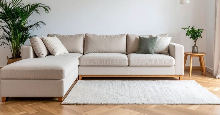
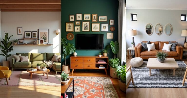
This is where people gather, so go for warmth and approachability. A mix of warm neutrals (think taupe, tan, soft white) with one or two accent colors keeps things cozy without feeling cluttered. Earth tones, dusty pinks, or olive greens work well for that lived-in feel.
Tip: Add texture through textiles to keep a mostly neutral room from falling flat.
Bedroom
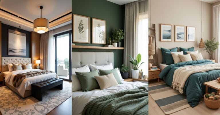
The goal here is rest, so lean into cooler tones like blue, lavender, or soft sage. These slow your heart rate and cue your brain to wind down. If it starts to feel too cool, layer in warm accents, wood tones, brass hardware, or warm lighting.
Skip jarring colors like red or citrusy yellows unless you’re going for a very specific vibe (and if you are, you better own it).
Kitchen or dining room
You want energy here, not chaos. Soft yellows, terracotta, or light coral bring warmth and stimulate appetite. Bold reds can work in small doses, but painting all your cabinets cherry red might be…a lot.
Accent walls, colorful chairs, or warm-toned backsplashes are all low-risk ways to bring in color without going overboard.
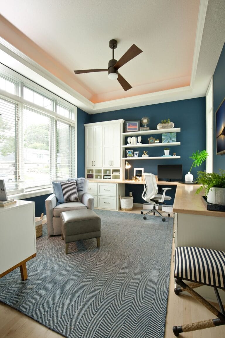
Home office or study space
This is all about mental clarity and focus. Blues and greens are the gold standard here. They promote concentration and reduce stress. Avoid anything too vibrant or saturated, it’ll feel distracting.
If you don’t want your walls in color, bring these tones in through a rug or art so the benefits are still there without overwhelming the space.
Kid’s rooms or creative areas
Here’s where color can play. Bright hues feel energetic and fun, but mix them with grounding elements to avoid overstimulation. A vibrant wallpaper on one wall paired with neutral furniture works better than painting the entire room teal and hoping for the best.
Let the color grow with them. What’s cute at five might feel too loud at ten.
How color supports mood and mental health
Beyond aesthetics and style, color psychology in interior design can directly impact your mental wellbeing. Interior designers know it, and so do therapists. The colors we live with every day influence how calm, energized, safe, or stressed we feel in our own homes.
This isn’t just feel-good theory, it’s backed by behavioral research and supported by what we already intuitively sense. A soft blue wall might help you sleep better. A yellow hallway might perk up your morning walk to the kitchen. And that cluttered space with clashing colors? It can leave you more frazzled than focused.
Design that supports wellbeing starts with three things:
Using color theory in interior design alongside natural textures helps make your space feel less staged and more like a personal sanctuary. And really, who doesn’t want that?
Color isn’t just color once it hits your walls
You’re not just picking paint, you’re deciding how a room makes people feel. And while there are plenty of “rules,” the best results come from paying attention, to lighting, layout, mood, and yes, even your own gut reaction. What reads calming to one person might feel cold to another. That’s why color psychology in interior design isn’t about rigid formulas, it’s about thoughtful choices that work for your space and your life. Try a swatch, take a risk, ignore a trend, and adjust as you go. If it feels good to walk into the room, you’ve done it right.
FAQs
1. What paint finish should I use for different rooms?
Use matte or flat for ceilings and bedrooms, satin or eggshell for living areas, and semi-gloss or gloss for bathrooms, kitchens, and trim.
2. How do I choose a color that works with existing furniture?
Match your paint to the undertones of your furniture. Warm with warm, cool with cool, or use contrast carefully for a balanced look.
3. Can I mix warm and cool colors in one room?
Yes, as long as one dominates and the other supports. Layer textures and lighting to make the mix feel intentional.
4. Should the ceiling always be white?
No. Light versions of your wall color can add warmth and softness, especially in smaller or darker rooms.
5. What colors are the least stimulating?
Soft neutrals, muted blues, pale greens, and gentle lavenders are the most calming and least visually stimulating.
6. Is there a safe “default” color if I’m not ready to commit?
Try a warm greige or creamy off-white. These neutrals work well in most lighting and with nearly any decor.
7. How often should I repaint a room?
Most rooms need repainting every 5 to 7 years. High-traffic areas may need touch-ups sooner.
8. Do accent walls still work, or are they dated?
They still work when used to highlight a feature like a fireplace or bed. Avoid random or disconnected accent walls.
9. What is the 3 color rule in interior design?
Use one dominant color, one secondary, and one accent. This formula keeps the room balanced and visually interesting.

